Dashy Dash
The Challenge
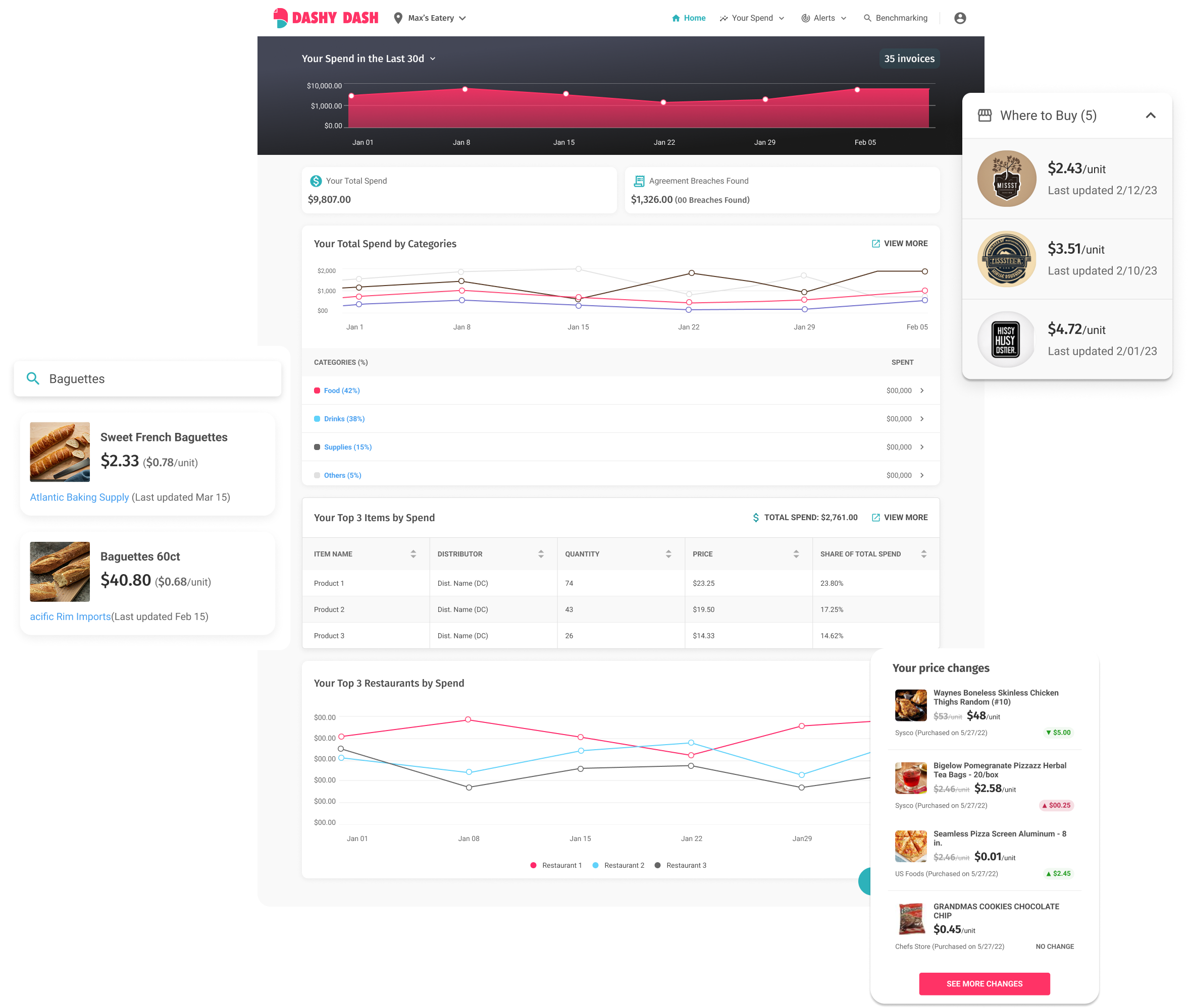
Restaurants face an uneven playing field: suppliers hold pricing power, and restaurants rarely know if they’re getting fair prices. Our goal was to break supplier opacity by helping restaurants:
Track and archive purchase invoices
Identify savings opportunities across produce
Benchmark prices with nearby restaurants
Get smarter with their purchasing decisions
The biggest design challenge: building a data-heavy product that remains simple, intuitive, and fast for busy restaurant owners.
Research & Discovery
Stakeholder interviews: Over 15 restaurant owners across California interviewed to identify key pain points - especially around invoicing, overpaying, and lack of transparency.
Journey mapping: Documented current-state workflows around ordering and invoice storage.
Prototype testing: Low- to high-fidelity prototypes were tested with users, including time-on-task and usability scoring.
Quant testing: Post-launch, we tracked feature usage rates, task success, and time-to-value.
Qual testing: Observed first-time users completing tasks, collecting friction points and language confusion.
Key insight: Users didn’t want raw analytics - they wanted clarity and contextual insights that tell them what to do.
Design Process & Iterations
Our guiding principle: “Make complexity digestible.”
Phase 1: Invoice Digitization & Analytics
Built flows to scan, store, and tag invoices
Created invoice filtering, labeling, and search functionality
Designed weekly/monthly spending dashboards for high-level visibility
Developed trend views for price changes across tracked SKUs
Phase 2: Benchmarking 2.0
This was the turning point.
Designed the Benchmarking feature, allowing restaurants to anonymously compare their item-level prices with other users in the same geography.
Built data visualizations showing where users overpaid/underpaid on produce.
Designed supplier recommendation flows that suggested vendors with better deals.
"It felt like I was finally in control of what I pay my suppliers."
Early adopter
#
Impact
+40% adoption of Benchmarking feature within first 60 days
Avg. cost savings of 12–18% reported by pilot users within 3 months
Reduced invoice search time by 70% through tagging and smart filters
Positive qualitative feedback from 80% of test users citing “clarity,” “control,” and “fairness”
Key Learnings
Designing for decisions, not dashboards: Restaurants didn’t want raw data - they wanted direct insights: "You're overpaying on tomatoes by $0.20/lb - switch suppliers."
Data trust matters: Visualizing benchmarks required transparency on how comparisons were made, without exposing other businesses.
Balance abstraction with detail: The UI needed to surface just enough to nudge action, without overwhelming users.